Easy Hai Re - Case Study
Easy Hai Re is a Marketing Project that aims to provide Educational Content on subjects of marketing, businesses and branding in an easy to digest format with a raw, rowdy and relatable tone for the Indian audiences.
LOGO EXPLORATION
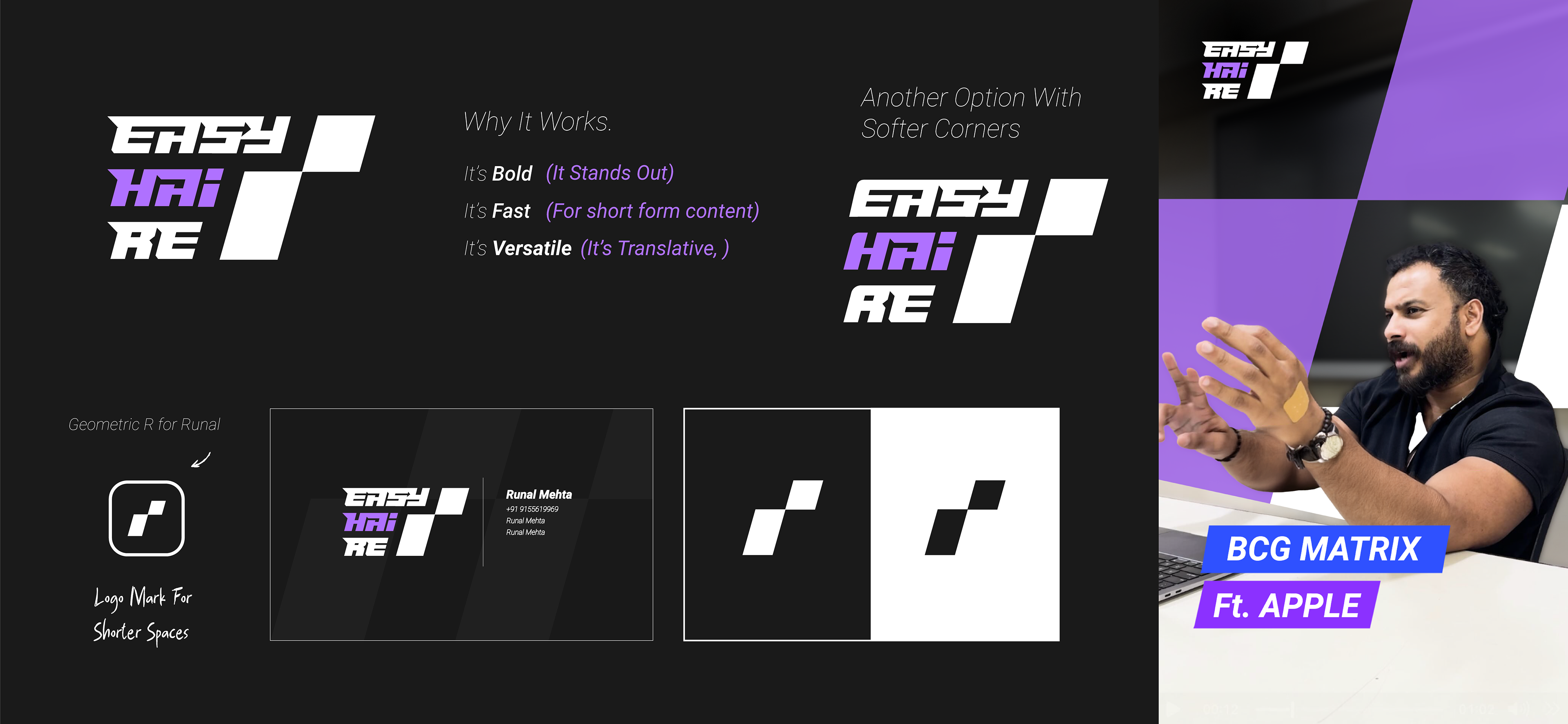
First step for setting the tone for the brand was to create a logo that resonates with Runal, the face of the brand. The challenge? To create a design that is based off of Runal's personality and the type of content the platform is trying to deliver. I envisioned that the mark needs to be versatile in nature.
Concept #1
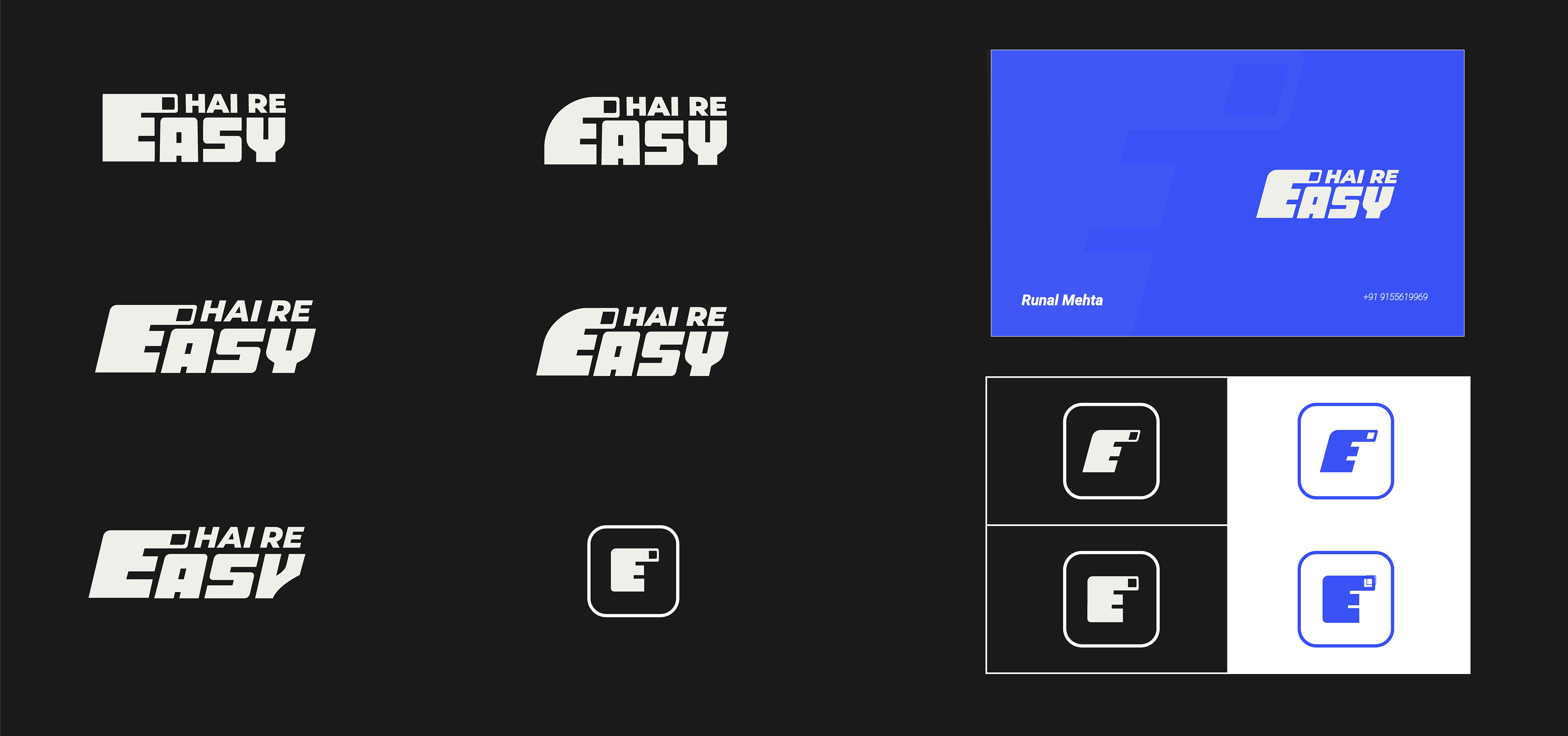
My first exploration was aimed to get the quickest ideas out of my mind to the canvas. Based on the brief I was trying to explore a mark that not only functions on the digital but needs to be easily eye catching on Merchandise. I explored a mark that was bold, and loud with a modern look that feels more relatable to the current gen of social media. I tried bringing multiple uses out of it as an abstract R that can be used to build patterns, flashy thumbnails and Instagram reels. It was supposed to work as a dynamic element always in motion inspired by the concept of reels in mind
The Problem? It felt too complicated to Runal. He wanted something more simple.
One takeback was he really liked how the reel cover might turnout with this direction.
One takeback was he really liked how the reel cover might turnout with this direction.
Concept #2

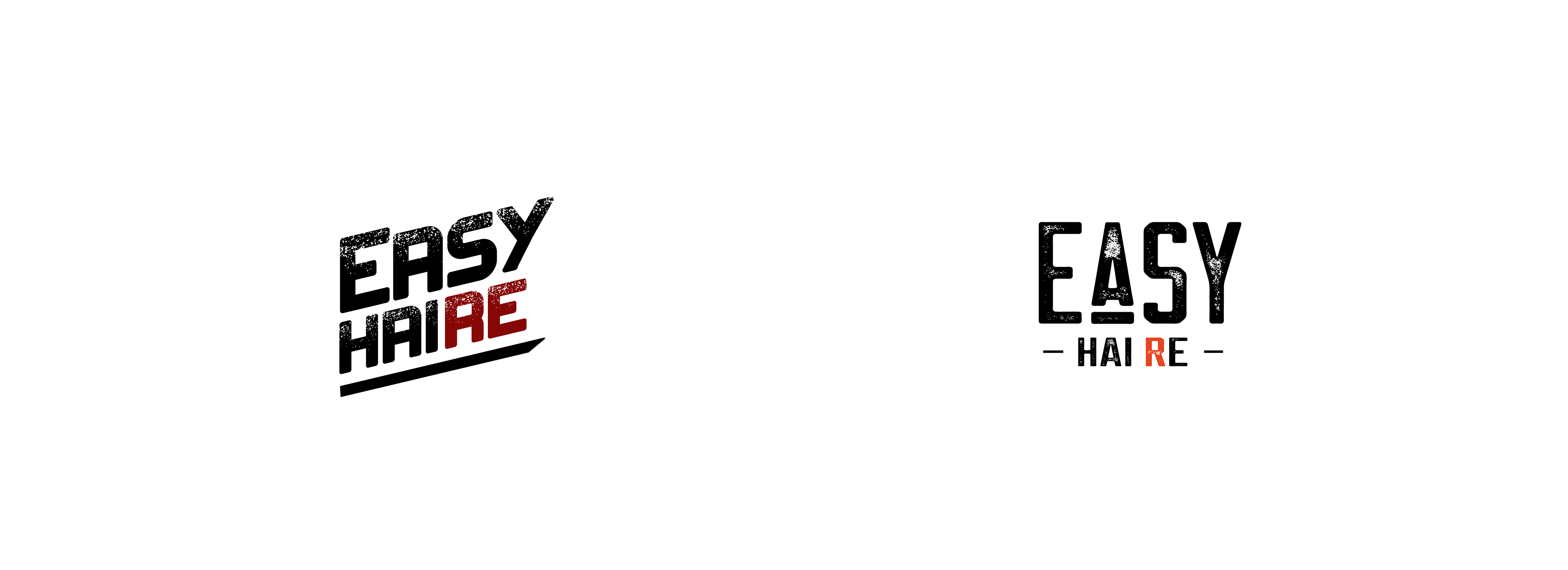
While browsing through Easy Hai Re's content. I got intrigued by the way hand gestures were being used & the more I looked, I saw it being done extensively. So I tried to incorporate that gesture into a logo, in a balanced format modifying the letter "E" in the logo. However it is more than that, as I am using it to guide the viewers eyes to scan the "Hai Re", Making the transition from 'Easy', 'Hai re' - seem very natural.
While browsing through Easy Hai Re's content. I got intrigued by the way hand gestures were being used & the more I looked, I saw it being done extensively. So, I tried to incorporate that gesture into a logo, in a balanced format modifying the letter "E" in the logo. However, it is more than that,
as I am using it to guide the viewers eyes to scan the "Hai Re", Making the transition from 'Easy', 'Hai re' - seem very natural.
While I really liked the intuitiveness of the idea, it felt short of carrying that 'rowdy' and 'raw' personality of Runal. It was too professional.
Easy Hai Re needed a grungy look and even more simplicity.
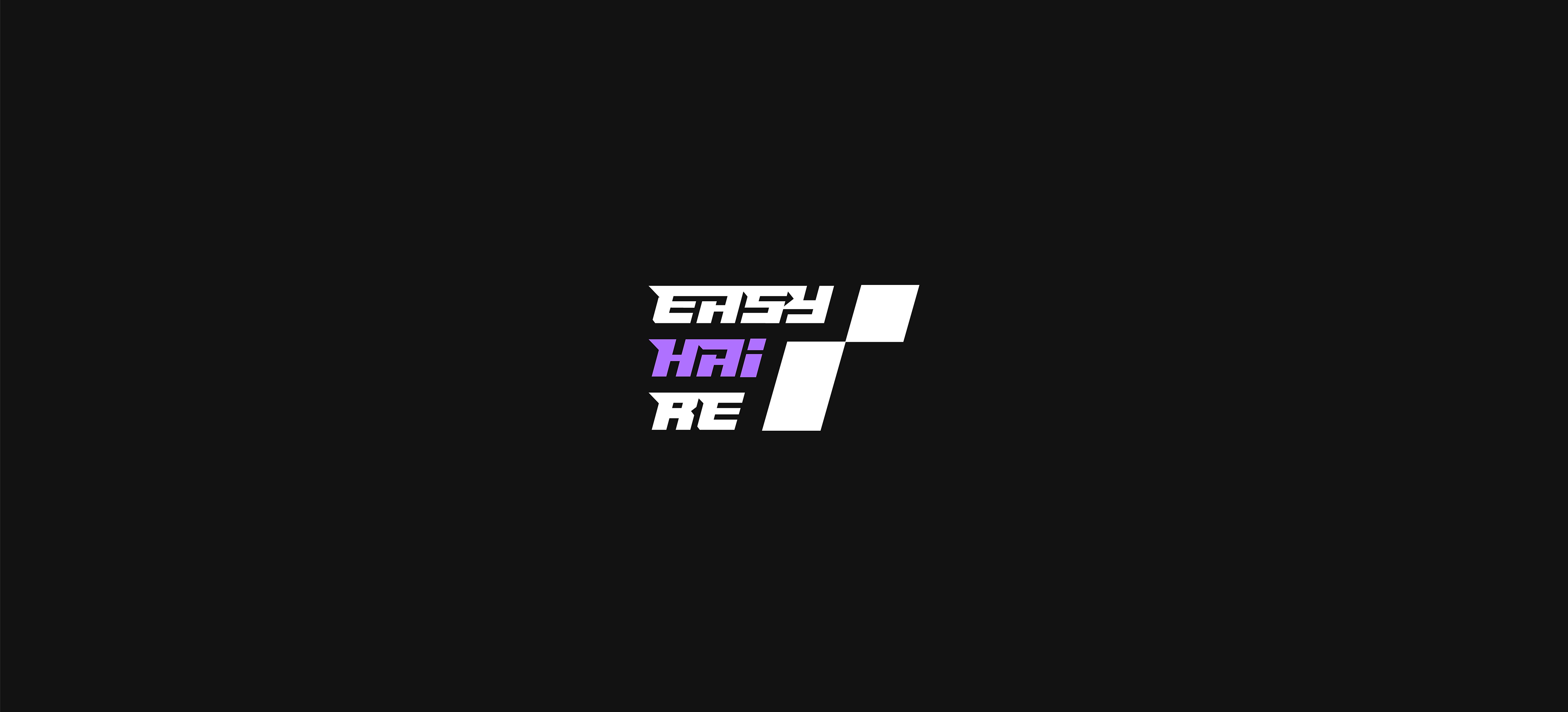
Concept #3
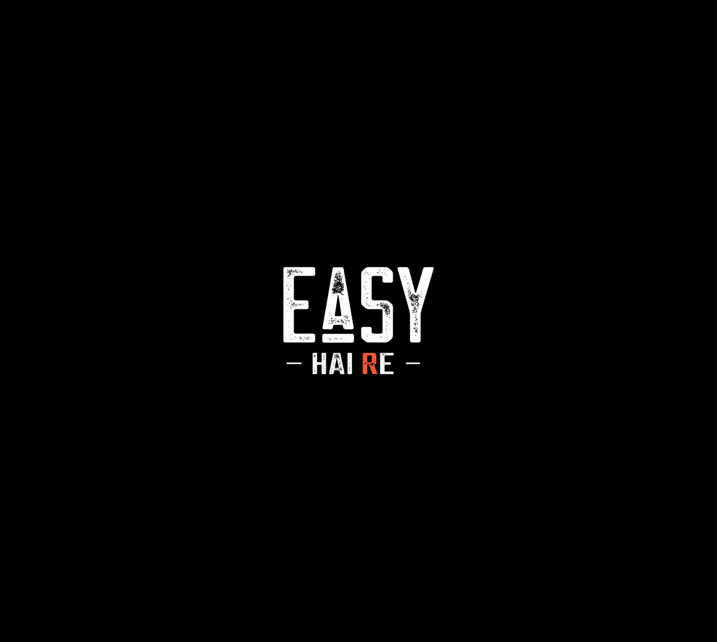
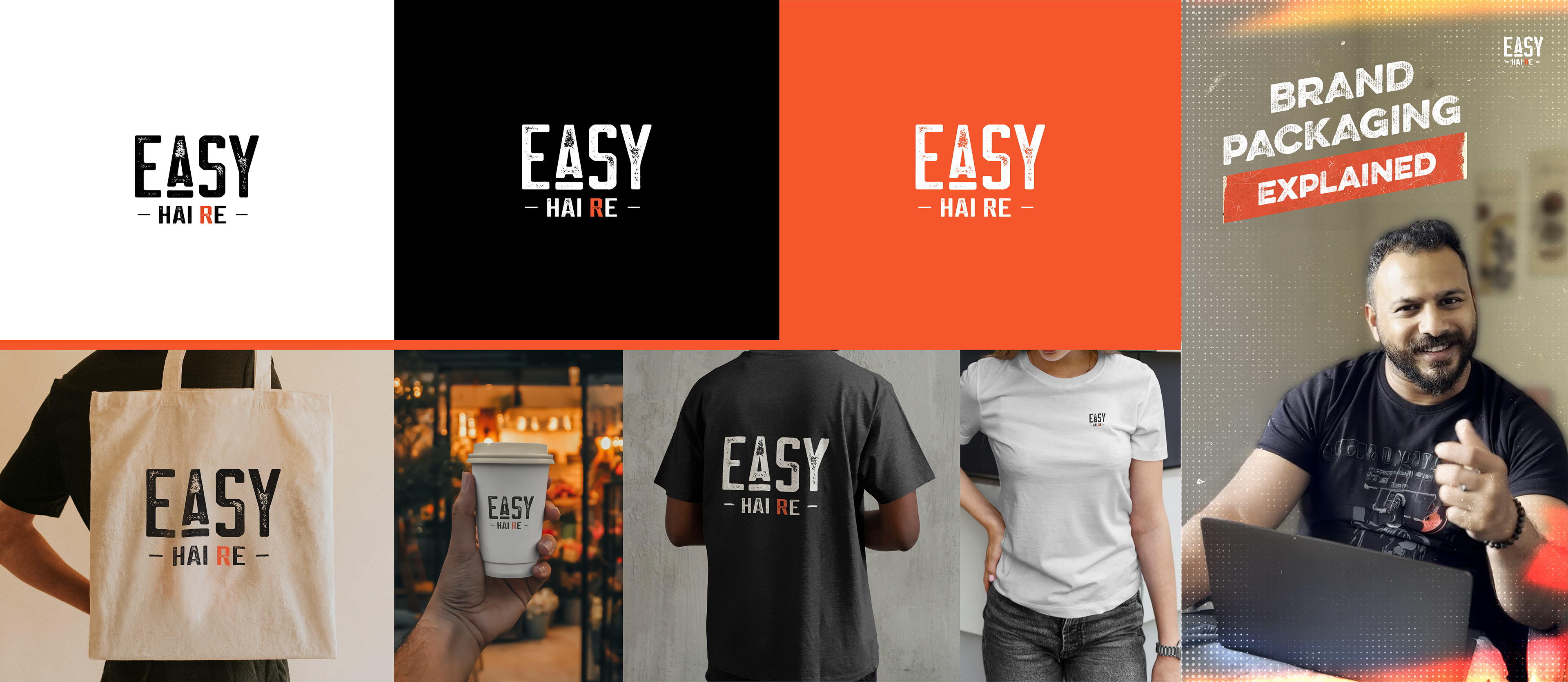
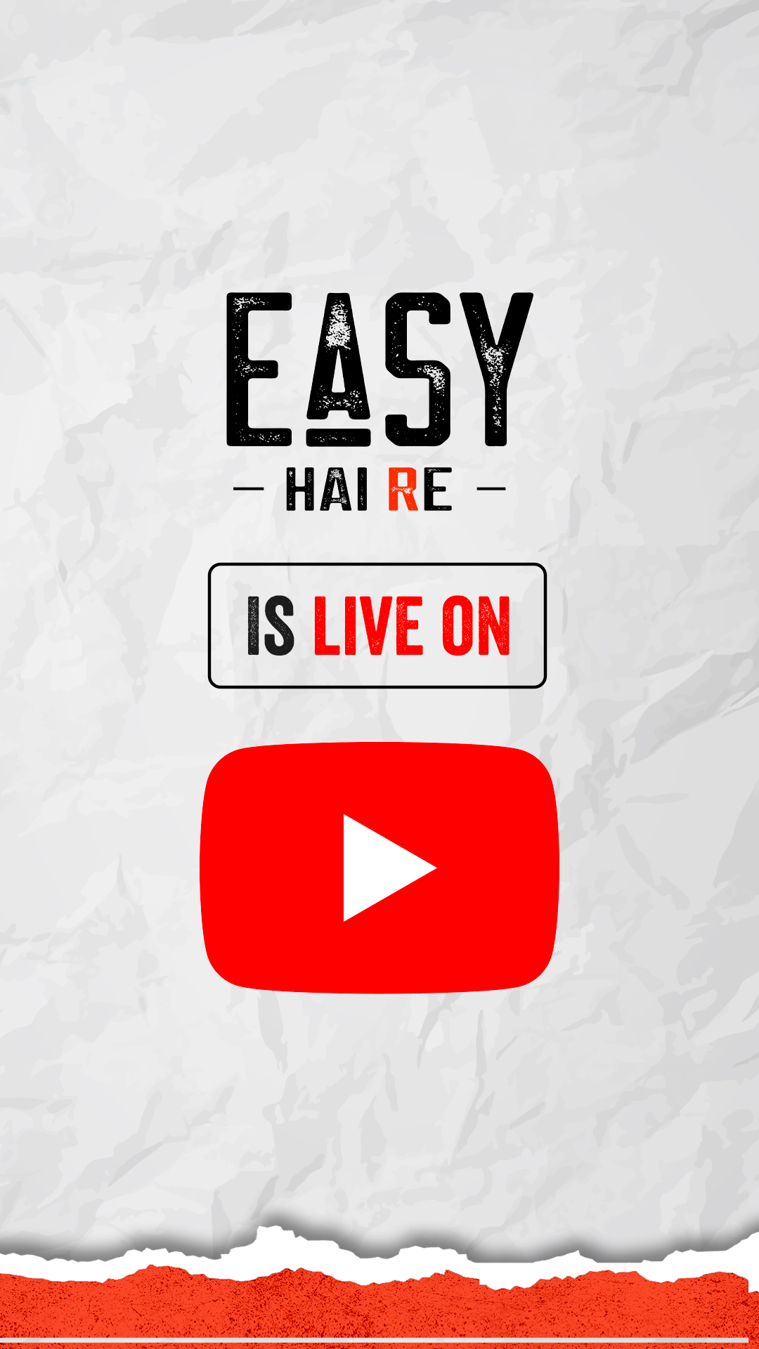
Finalized Version
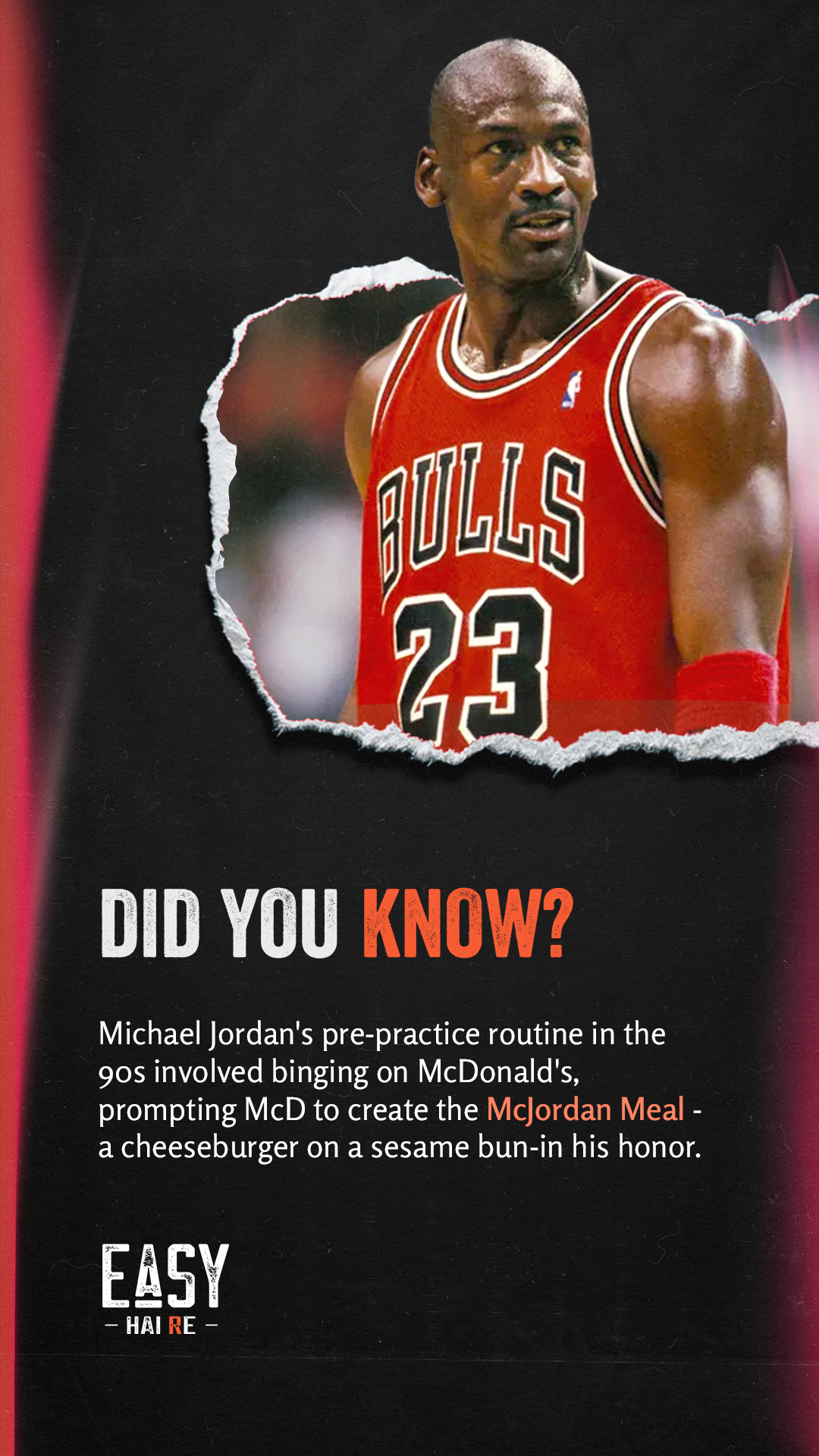
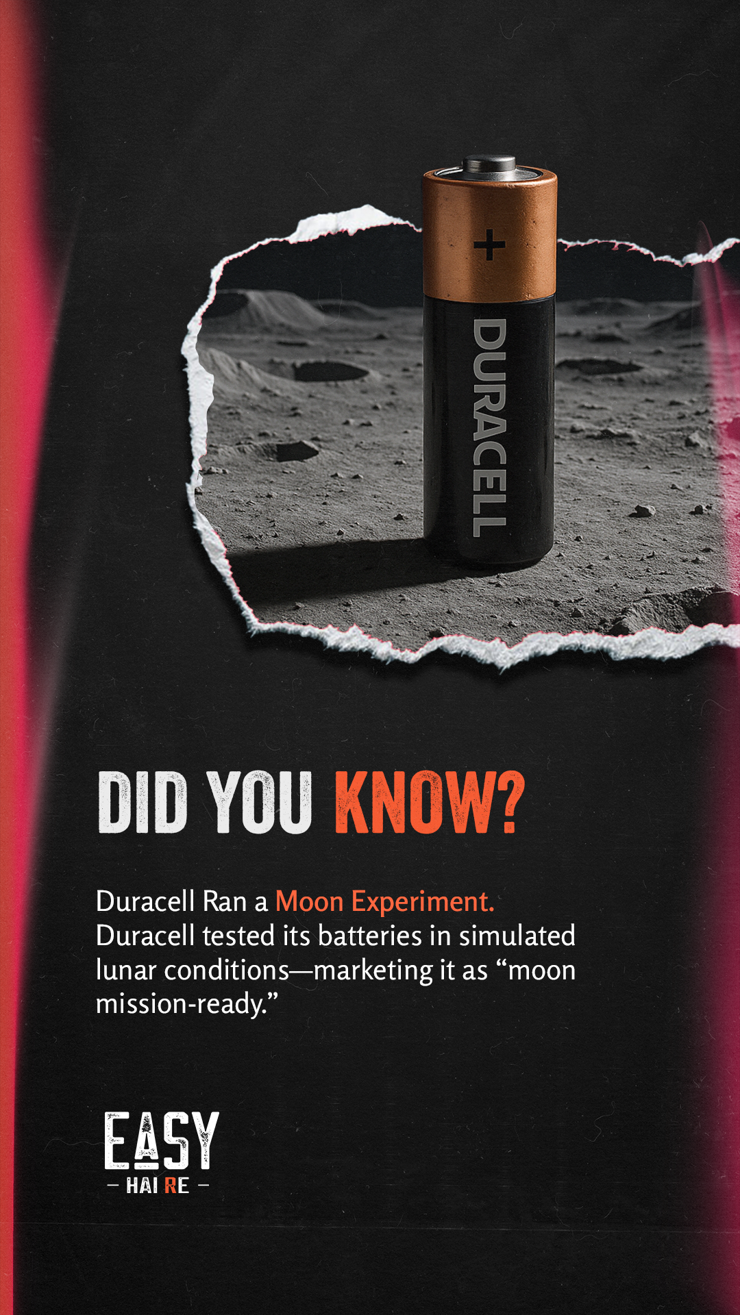
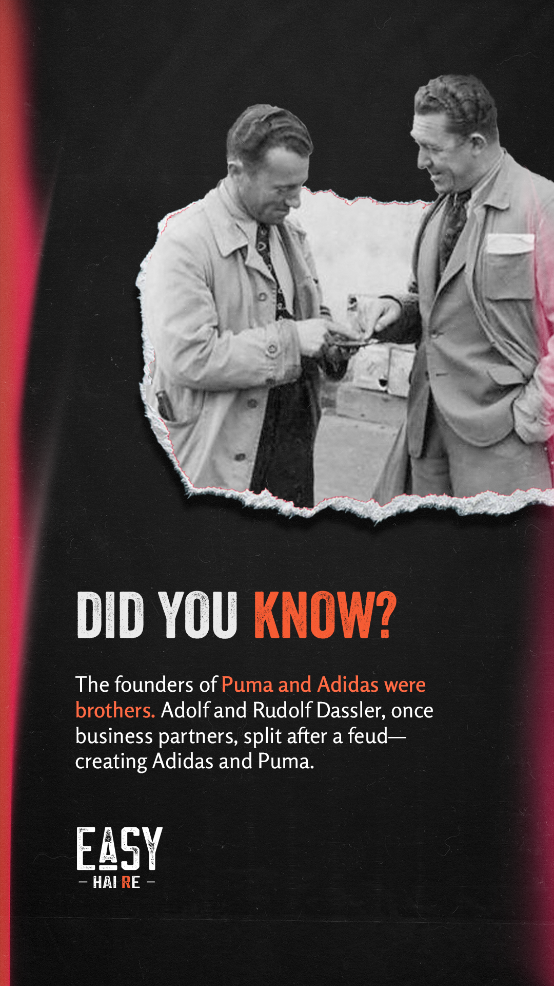
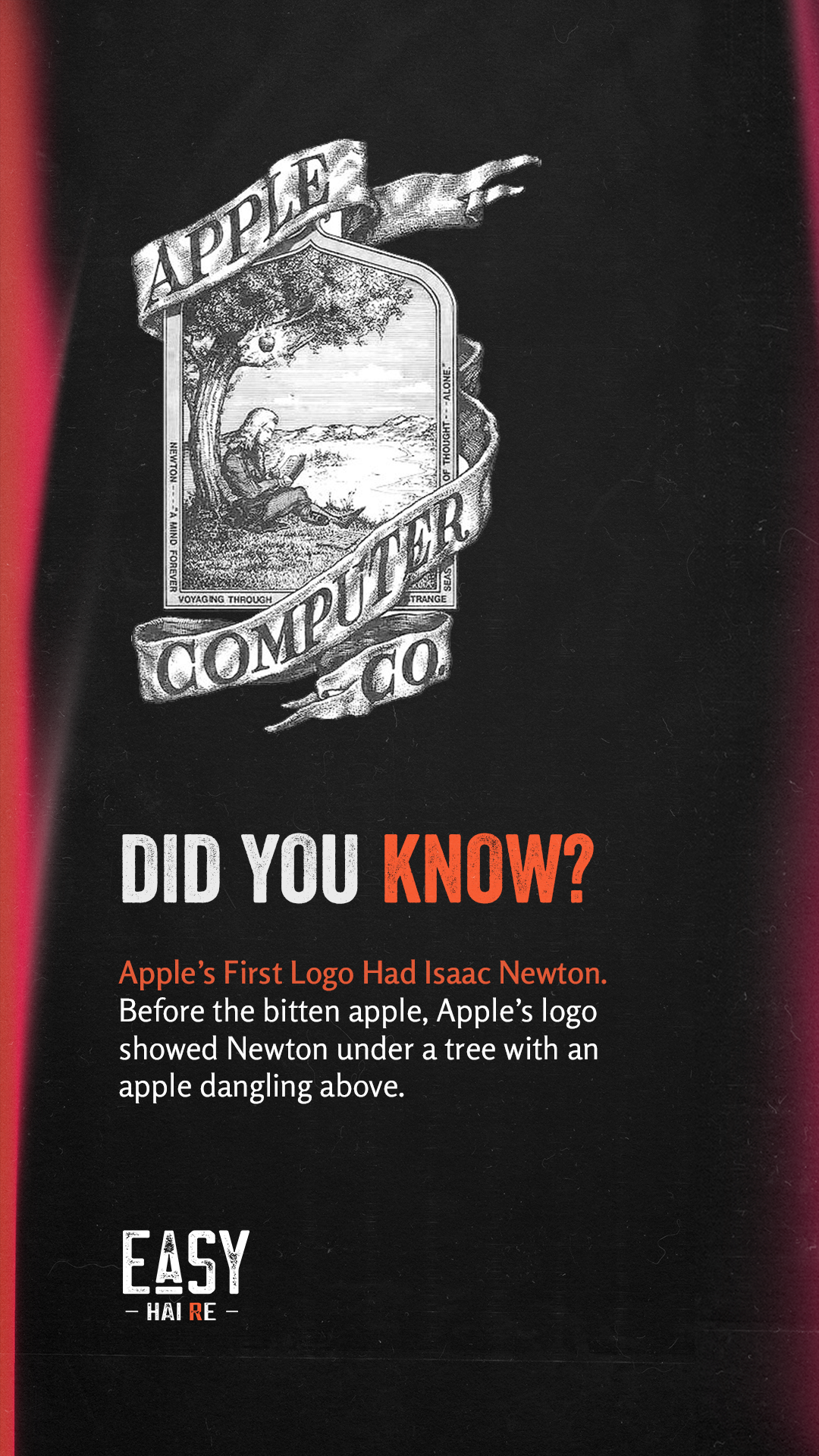
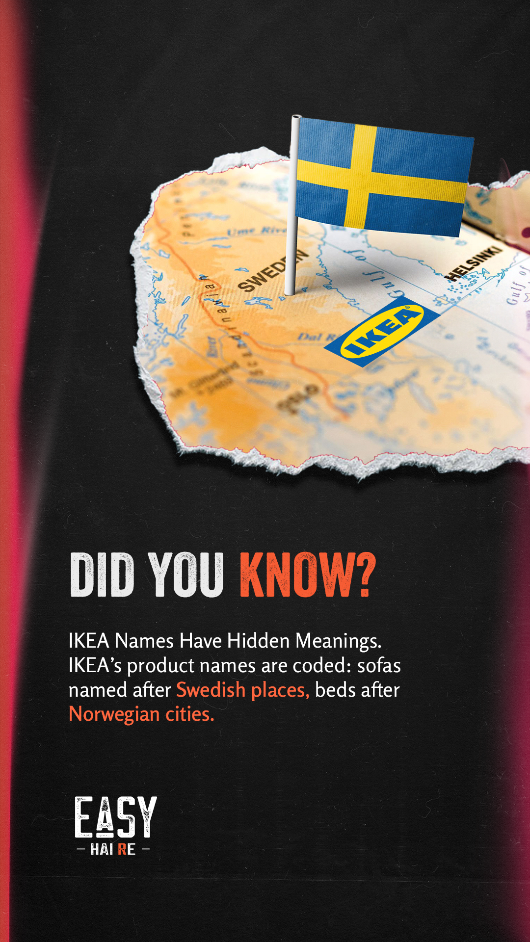
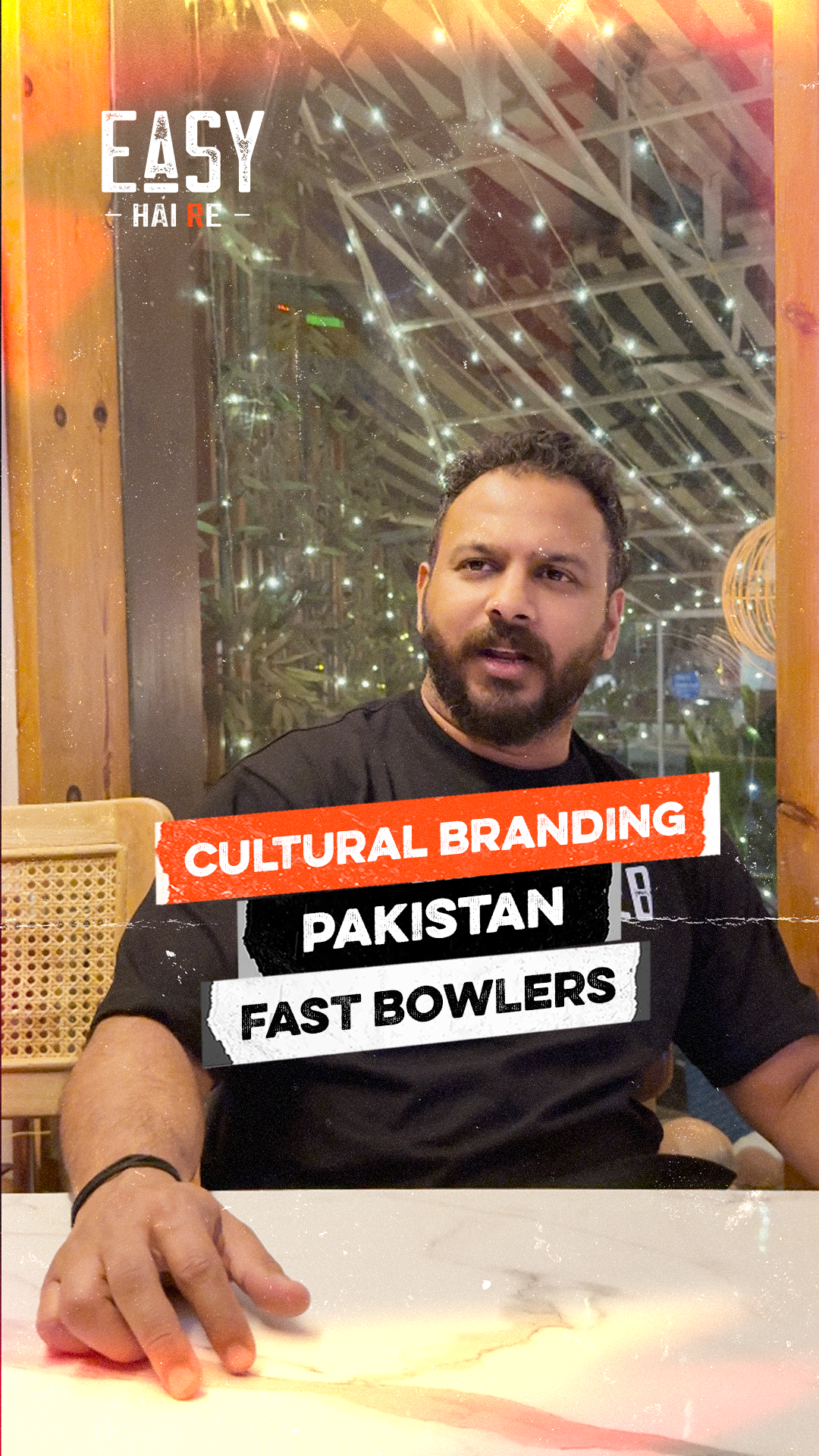
Themed Stories
Reel Covers

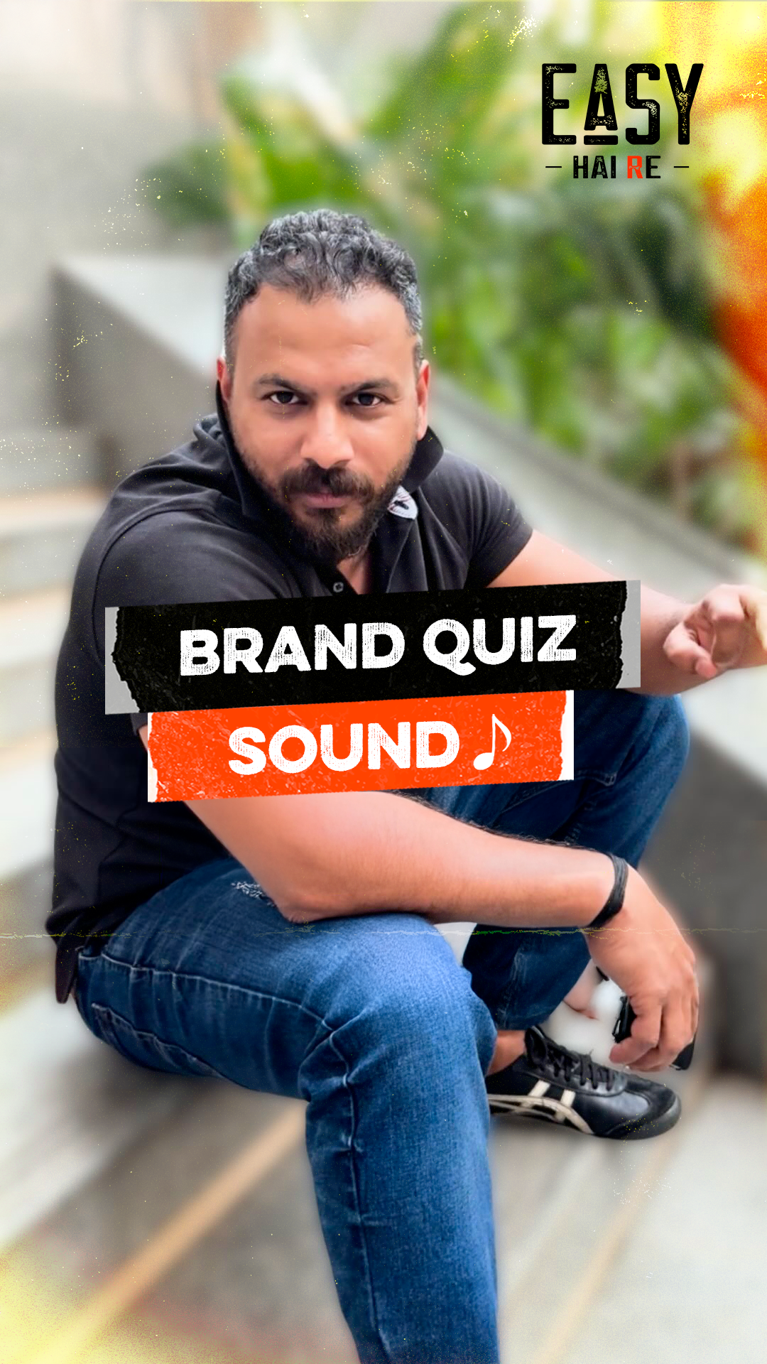

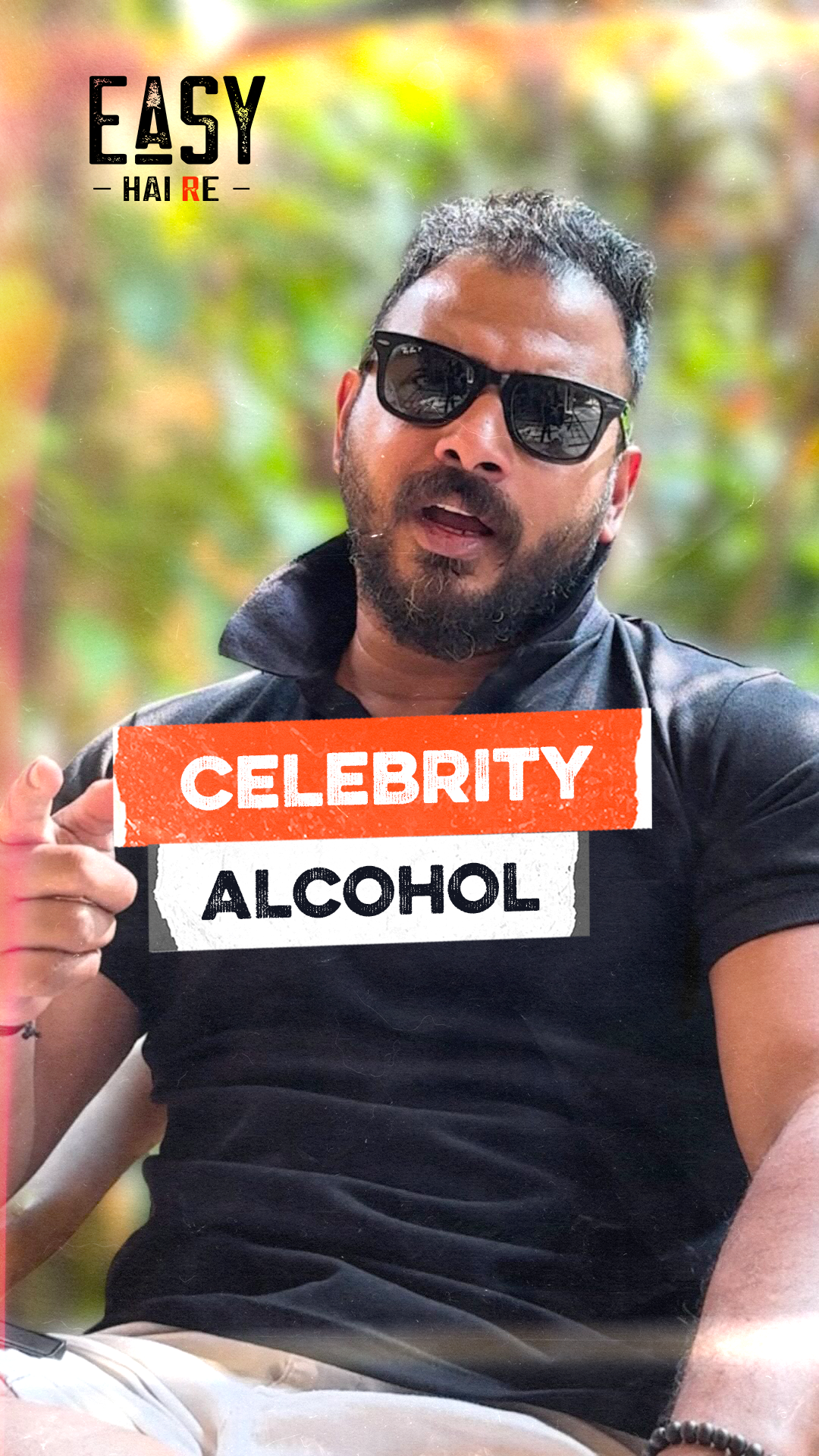


Instagram Stories


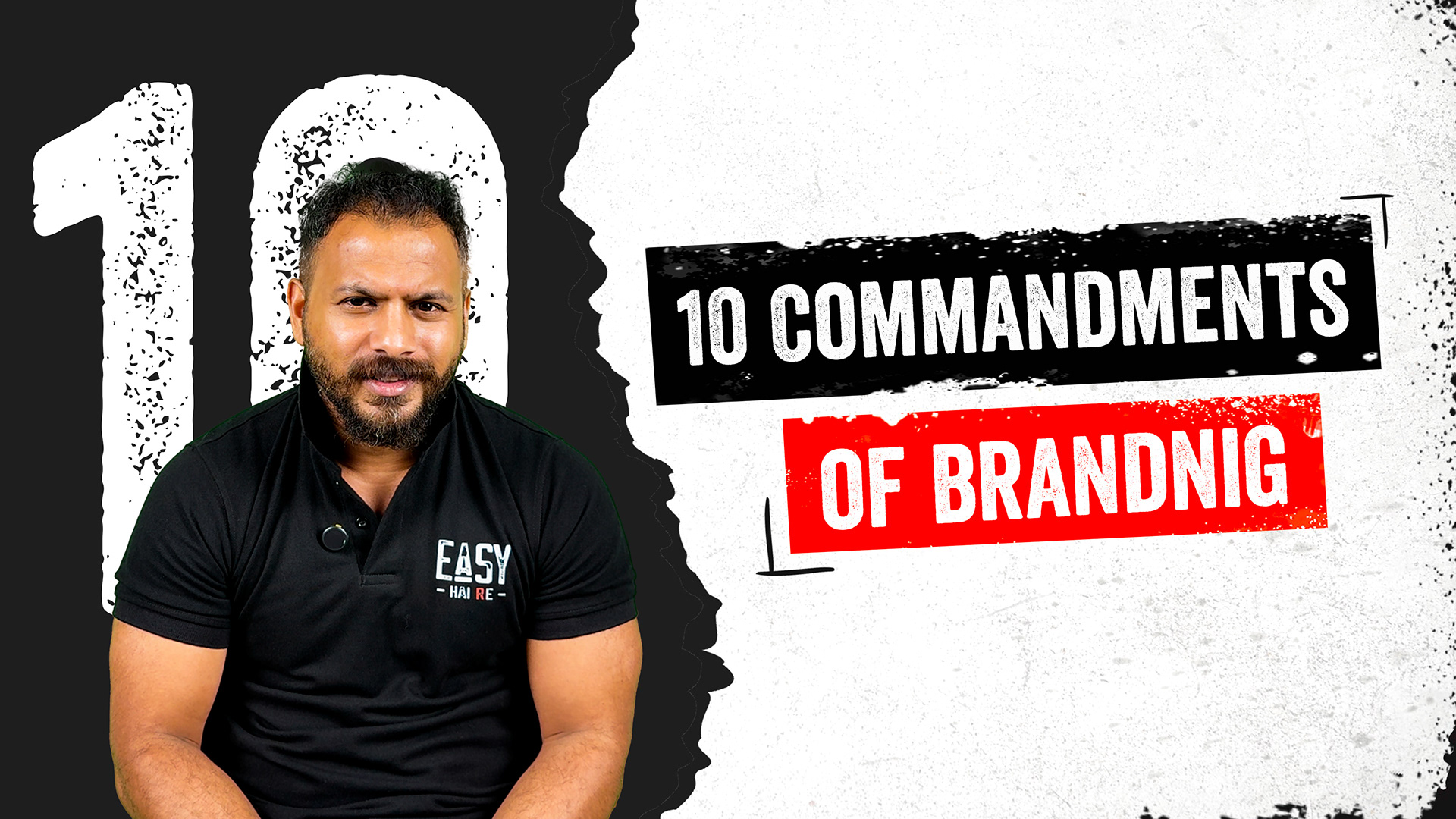
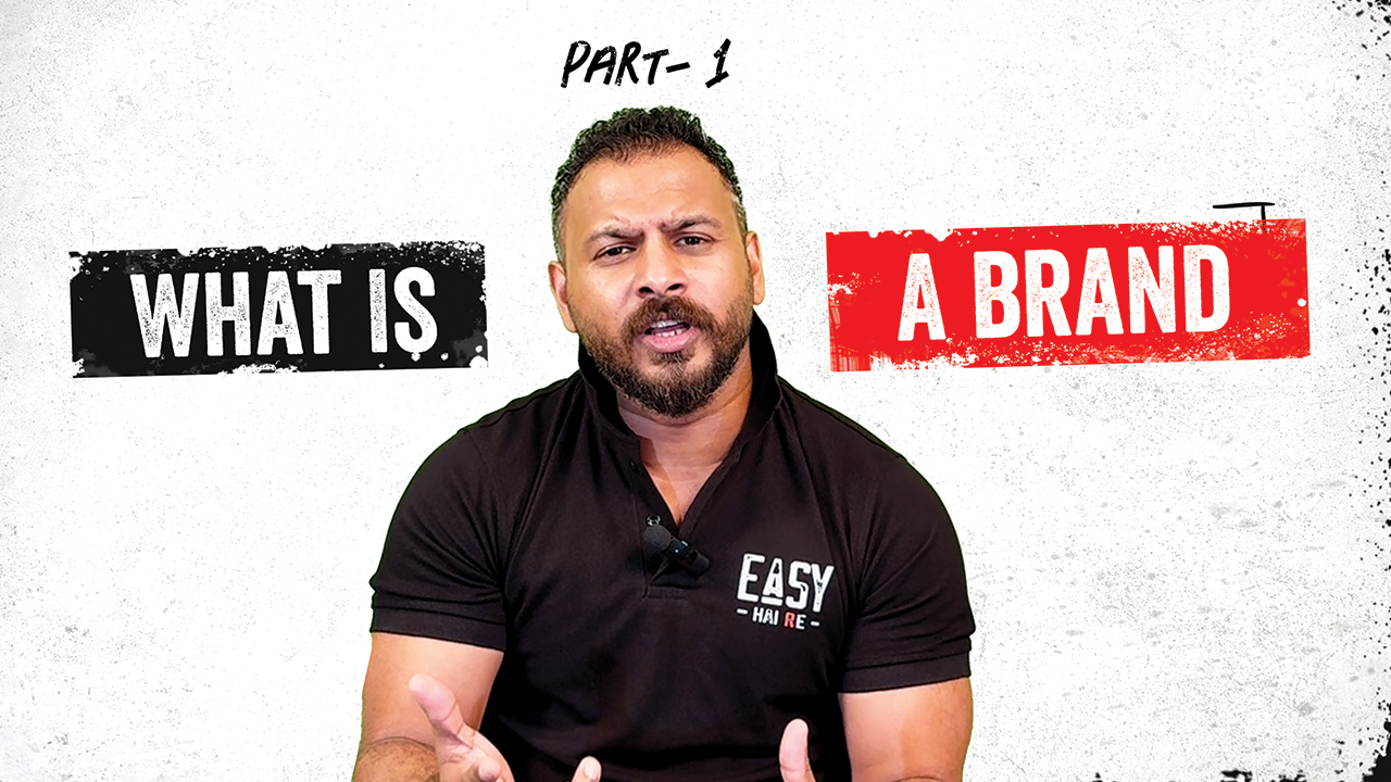
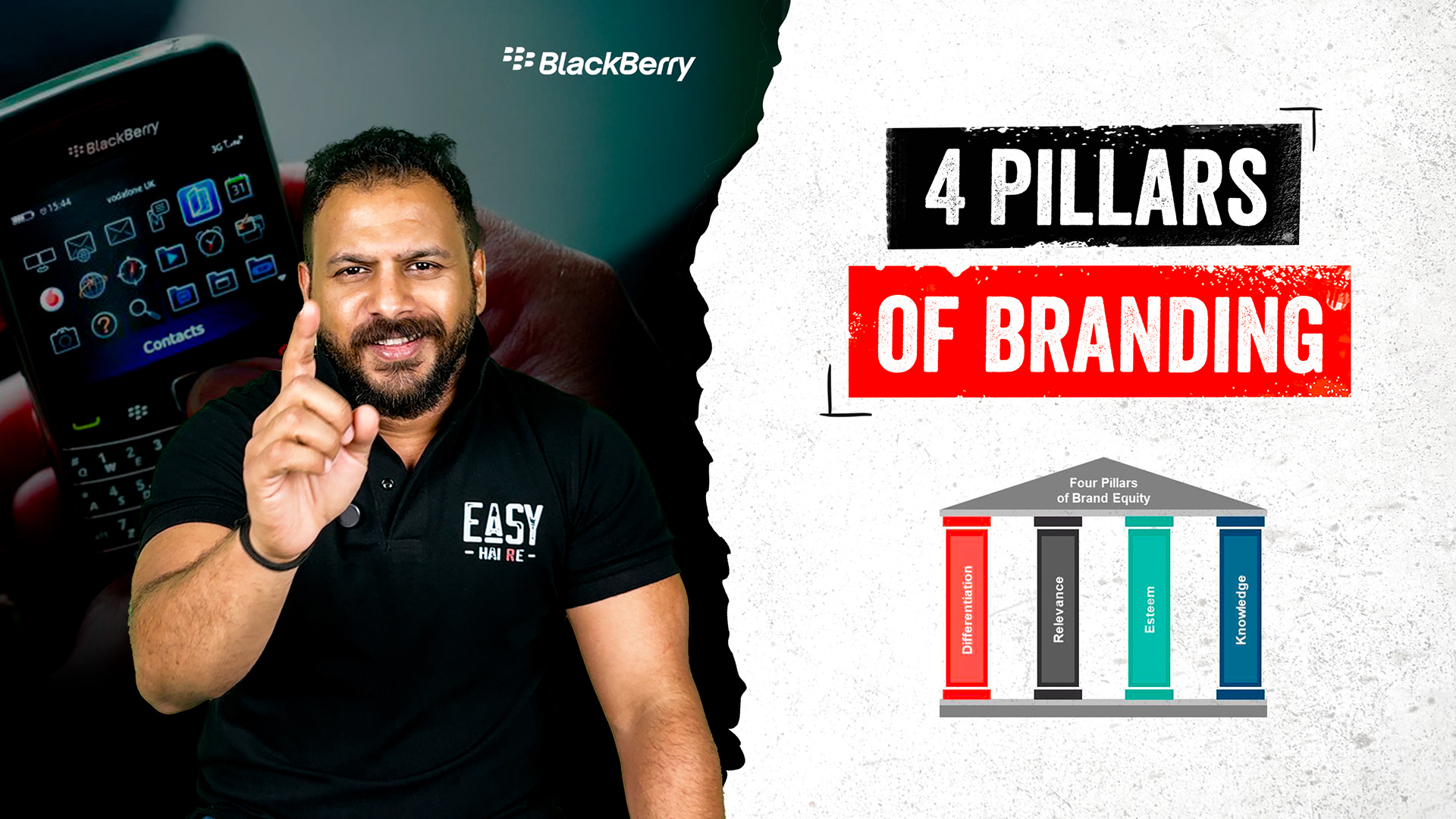
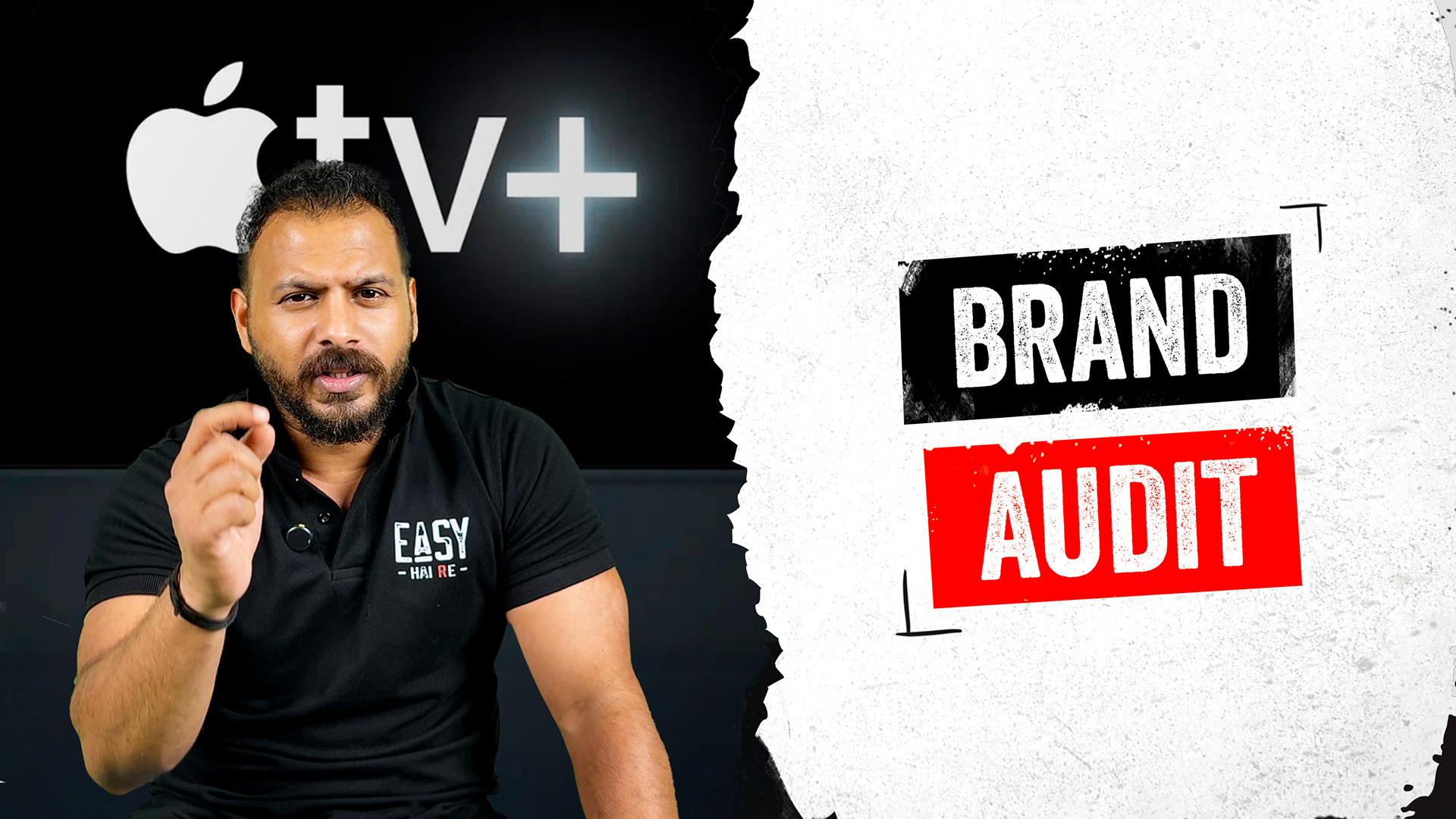
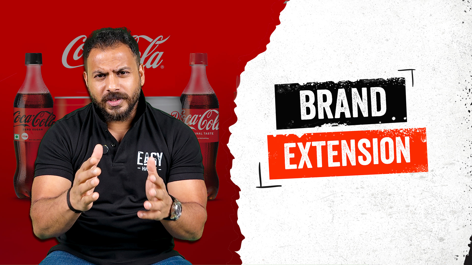
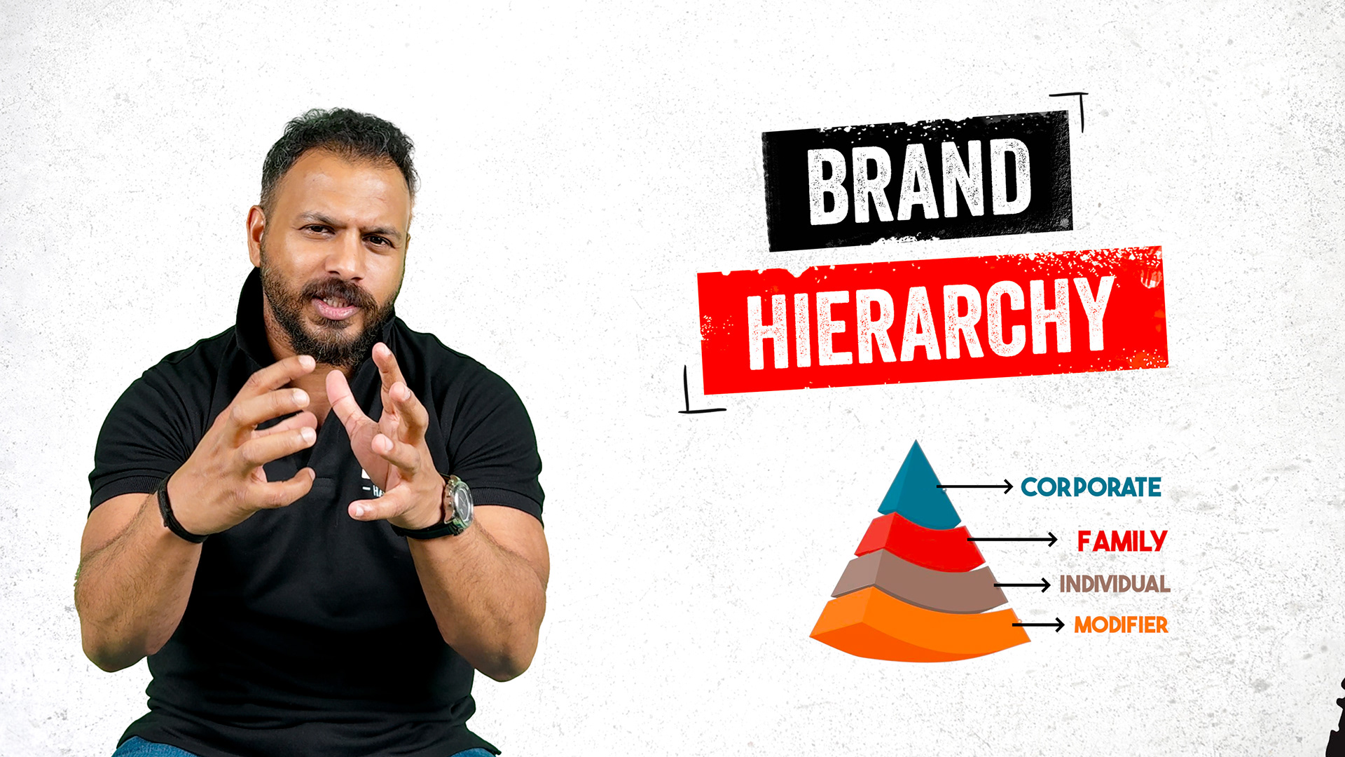
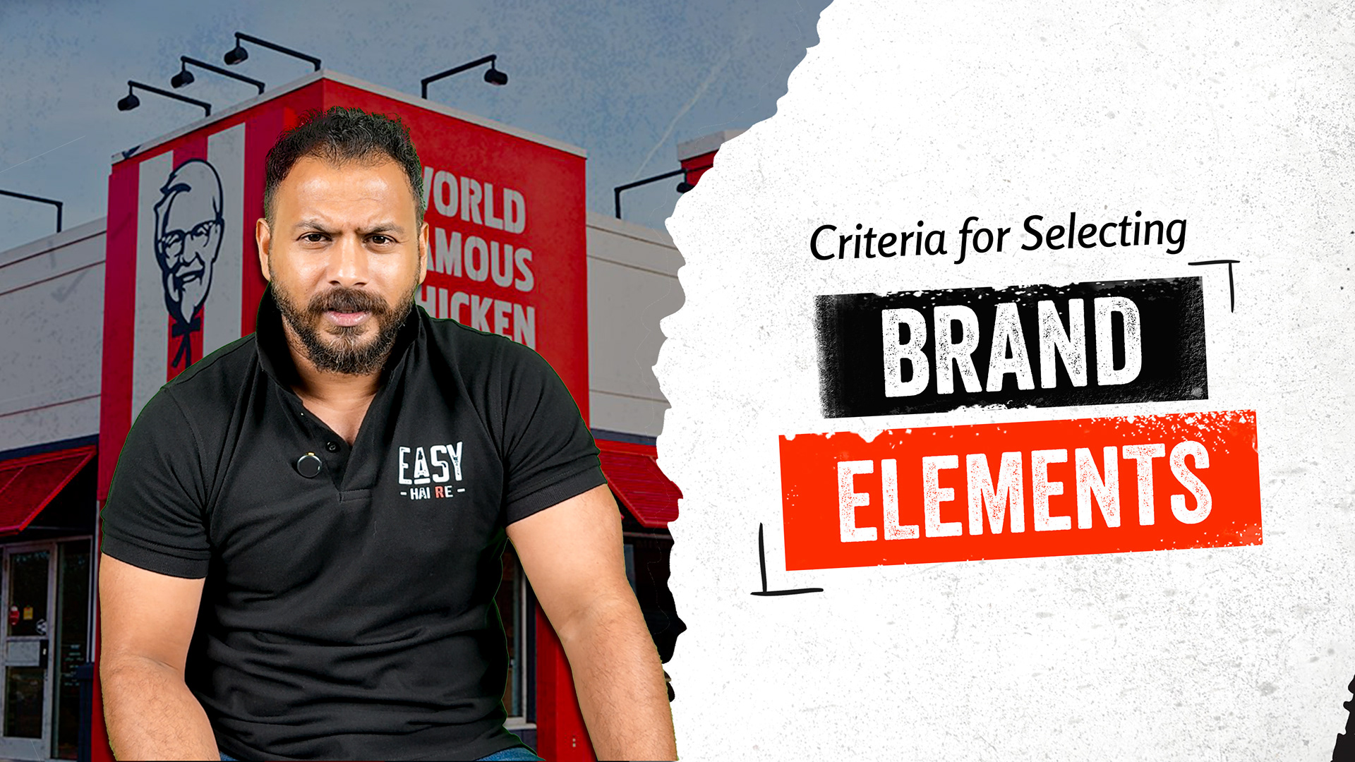
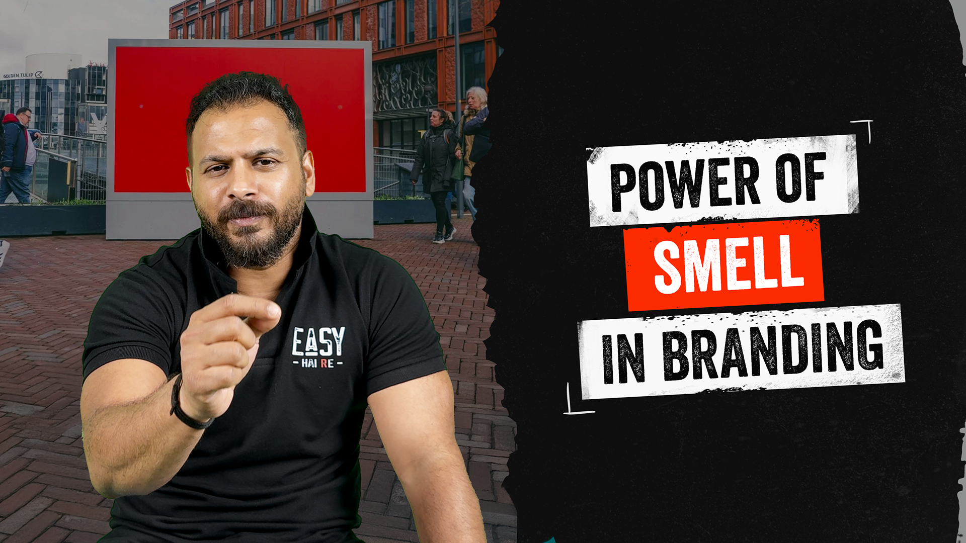
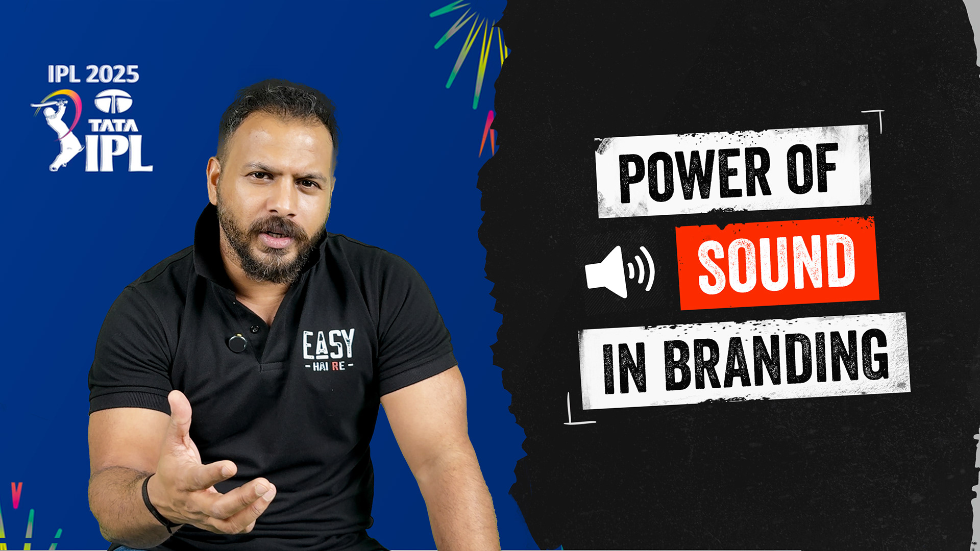
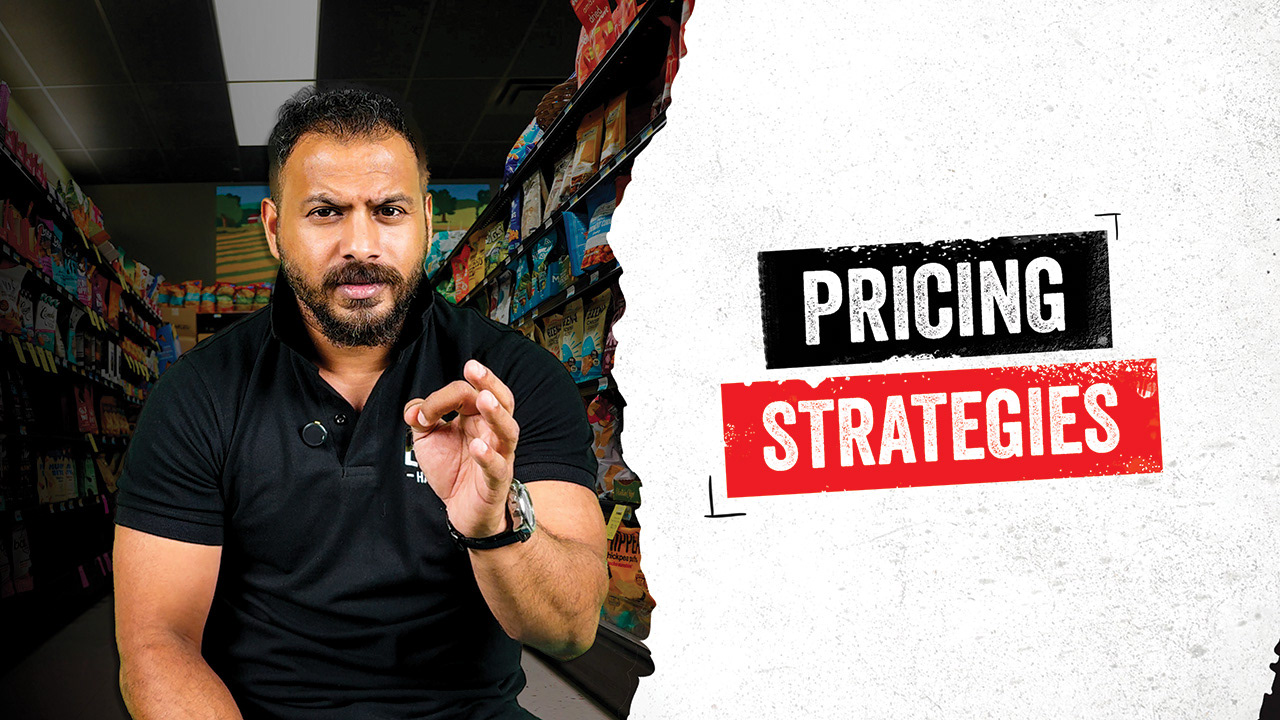
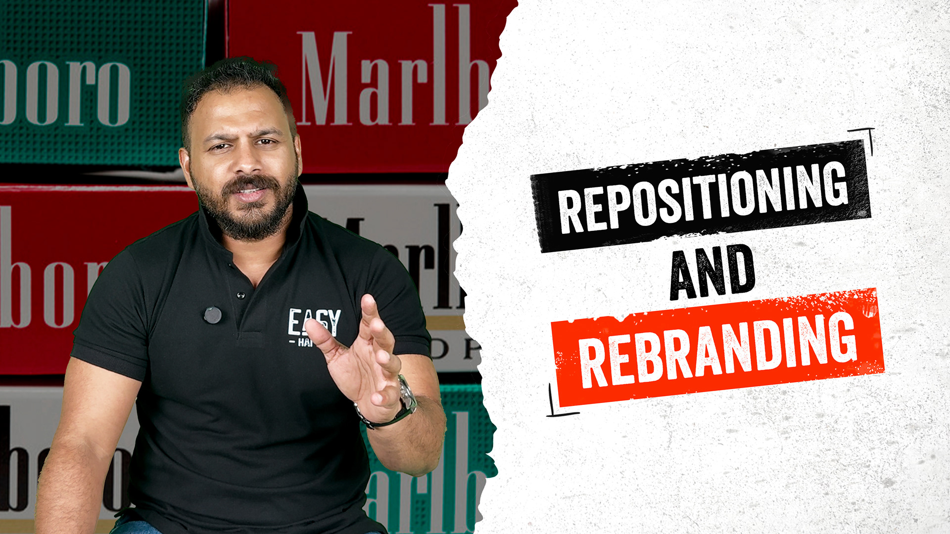
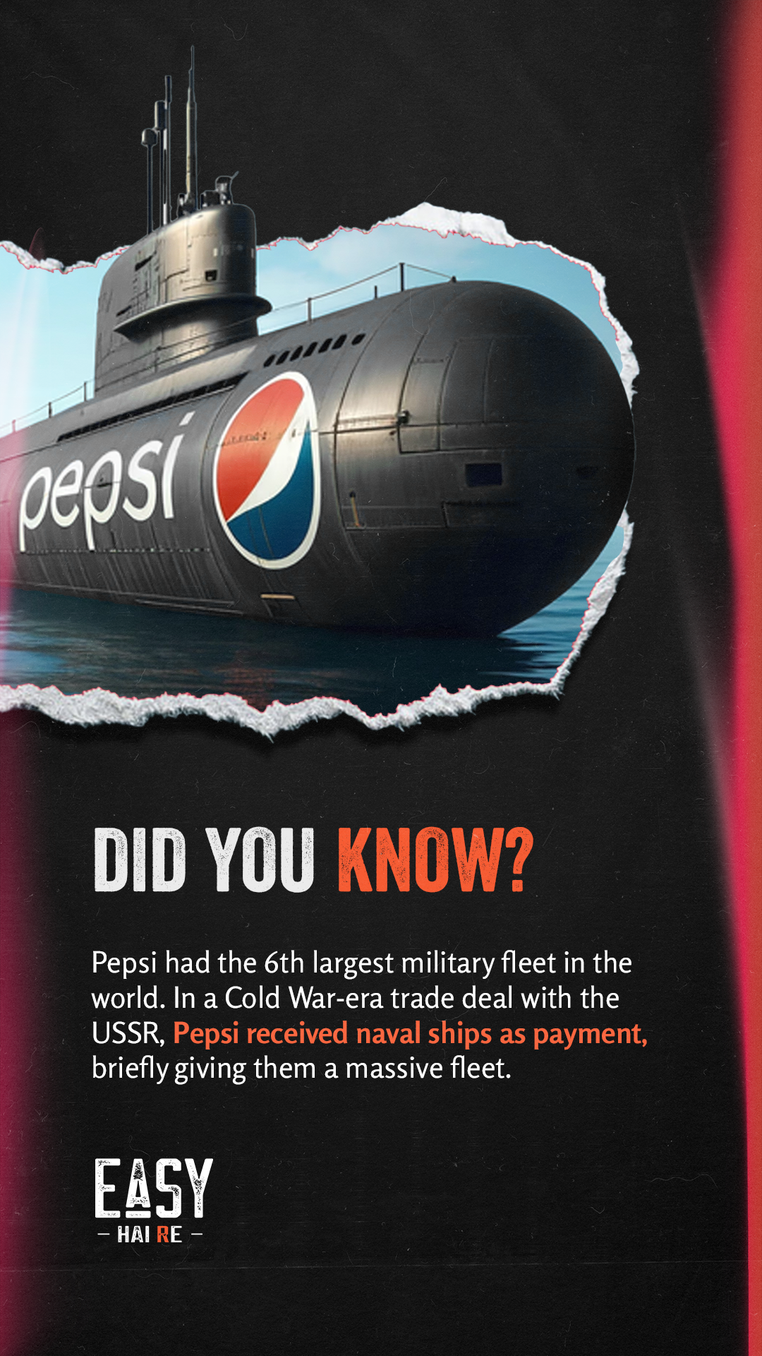
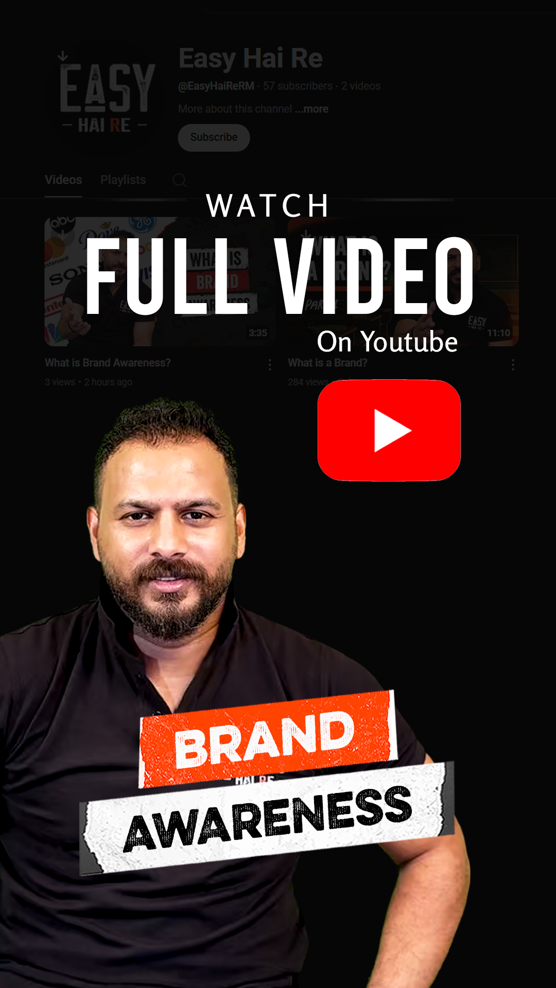
Youtube Thumbnails